Pro Logger
ProLoggerInstall_1.0.1.160
https://canbusanalyzer.com/wp-content/uploads/edd/2023/12/ProLoggerInstall_1.0.1.160_20240804.msi
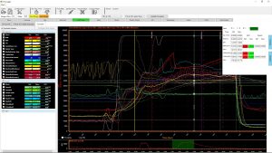
Viewing a single log with time slip information
This screen shot shows displaying a run log with time slip information. The software draws the increments in the log so you can see what was going on at that part of the track, breaking it down to help find improvements in performance.
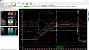
Comparing runs with Timeslip information
This screen shot shows the ability to compare incrementals in the two logs to show where the changes picked up performance.
Comparing Logs Full Screen
This screen shot shows two run logs being compared, the first being a 7.91 second pass, and the next pass being a 7.74 second pass. The software will automatically select and zero the run based on the start of your launch timer. Where instances appear more than one launch time is found, the one with the higher throttle position at launch will be selected, or you will be asked to manual zero the run. The Software allows you to enter time slip and weather information, then the software puts the markers for the increments you have entered and shows the comparison between the two. The Reference log is always the first log loaded and is indicated by the lines being dotted (sometimes appearing lighter) and the New log being that later log and appearing with solid lines. As you move your mouse over the lines, the software highlights the lines in both the graph and in the signal viewer window. In the signal viewer window the data is labeled as Ref (reference), New, and Diff (difference). The difference displayed is the value difference between the reference log and the new log. This functionality allows for a quick visual view of the differences in the runs as well as where each run performed better. The run zoom window on the bottom allows you to quickly scroll or move to the different parts of the log.
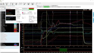 Configure signal layout color range precision etc…
This screen shot shows how the setup for the signals is done. You can choose a signal, select a precision value (0.0, 0.00, 0.000 etc…) Select a color for this signal, a Chart you want this signal grouped in, the position in that group it will appear, a Y axis min and max value to set the range of the signal to be displayed, the units the signal was logged in, and the units you want to display that signal in, and any filtering you wish to add to the signal to smooth it out. The signal group box on the side allows you to see what signals are set to what groups and what groups you have made available. These groups are all user configurable and nameable.
Filtered map with 20 samples and recommended changes. – This screen shot shows the table view of the map tracing ability. This map was set to have a filter of AT LEAST 20 samples per site to consider its average error and calculate the change needed at these points.
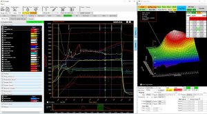
Log and Map Tracking
This screen shot shows the map tracking ability of the software. The displayed map on the right allows you to filter out situations to get the most accurate error calculations possible. You can filter by any other signal in the log, as well as number of samples required before the error is considered and calculated. You can also filter by certain times in the log, so you can choose to ignore any part of the log EXCEPT the run for example. The smaller window on the upper right shows the values at the site as well as the surrounding sites to help you make any decisions on adjustments needed.
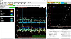 Log for 32 minutes calibrating the mass air sensor
This screen shot shows a long drive logging various channels. The software takes all 32 minutes of this data and calculates the errors for all of the data based on filter settings and channels chosen. This makes quick work of over a half an hour of data and quickly gives the user the calculated and filtered error to instantly calibrate the mass airflow table in this case. You can see the white dotted line is the old value, and the solid line is the new calculated value by the software. This table can now be copied and pasted in to the ProEFI software and in an instant, your mass air flow table is calibrated. This same functionality can be done for any other table. For example you can log your air fuel sensors for both banks of the engine, add them together and average the value, divide it by your target to get your percentage error, and populate the filtered and sampled v.e. table with all of the steady state data from a long drive to quickly drop in changes in to your v.e. table and in an instant be done calibrating! You could log cold start and map out your warm up enrichment table right from the log!
Map after smoothing function is applied
This screen shot shows how the smoothing function can be applied to a rough map to smooth out the rough areas. You can choose to keep peaks and smooth up to them, or eliminate peaks and smooth the whole map. This map can then be copied to the clipboard and pasted in to the calibration in the ProEFI software.
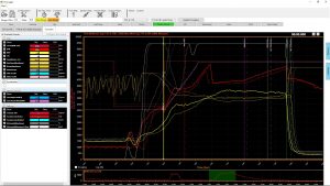
Quickly toggle between layouts fuel tuning to traction control
This screen shot shows that you can quickly toggle between signal layouts, showing only the signals that pertain to the tuning function you wish to address at that time. This makes jumping through lots of data to sort out a tune a snap!
Unfiltered Map Tracking showing where you have been and what changes to make
This screen shot sows the map trace in table form with NO filtering so you can see the exact path you took through the v.e. table during that run, and also the calculated changes that would be needed based on the air fuel values it saw at those spots compared to the target at those spots.
